Gliffy Editor

Lead Designer & Director of UX, 2012-2016

Things that are easy to use survive, regardless of what is fashionable …But if things are created merely for a passing vogue and not for a purpose, people soon get bored with them and throw them away.

- Sori Yanagi

Gliffy is a web based diagramming app that allows people to create flowcharts, uml diagrams, wireframes, mindmaps, and many other types of technical diagrams. It launched in 2005 and I joined in 2012 as their first full time designer to help with a redesign of the app during their transition from Flash to HTML5.

GOALS: Getting Started Quickly & Ease of Use

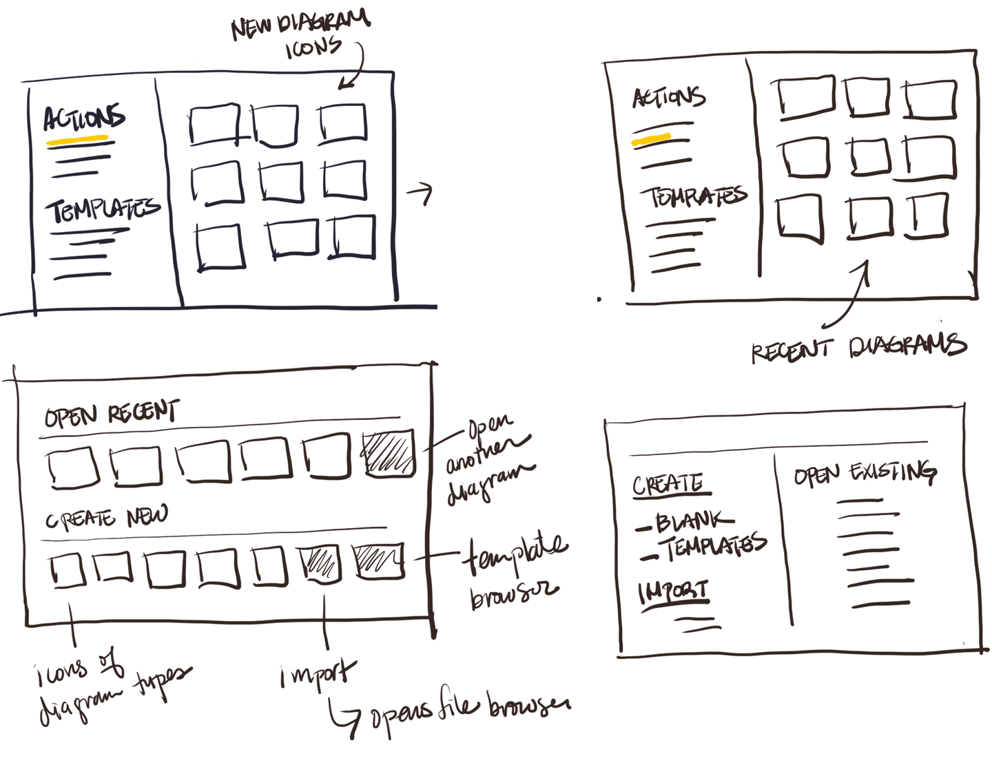
The main goals we set for the redesign of Gliffy (and which became our guiding principal during my years there) was to make it the most intuitive app for creating diagrams. It didn't have the depth of features that desktop incumbents like Visio had, but it would offer people the fastest, easiest way to visualize their ideas. An example of a process that we streamlined was the "start" experience for users when they logged into the app. This is what that experience initially looked like:

If a user didn't want to start with a completely blank slate (which was often the case if they were a returning user), it took a minimum of 3 clicks to get started. If they were brand new, they were presented with an overwhelming range of options. We looked at the click through data and learned that the 2 actions customers wanted to do most after logging in were to 1) start a new diagram or 2) continue working on an existing diagram. We looked at a number of different options to prioritize those actions.

To give users the clearest possible path to their goals, we prioritized the primary actions users wanted to take and provided visual cues in the form of thumbnails for recent diagrams and diagram types. Instead of 3 clicks this option required only a single click for the majority of users to get started.

Over the course of 3+ years, I designed many new features including:

  • Custom shape libraries
  • Mindmapping
  • Layers
  • Tables
  • Shape Linking
  • Wireframing
  • Themes

Maintaining Consistency

One of the main challenges the team faced over time was maintaining consistency across the app. To help developers with this, I created an HTML & CSS style guide for our most common components.

Customer Feedback

To gauge the effects of our design efforts, we collected and closely monitored feedback from our users, initially through a Feedback dialog where we asked users to rate design, ease of use, performance, and stability on a scale of 1-5 (1 being horrible and 5 being awesome) and later through NPS. During my time at Gliffy, we consistently received high scores (between 4 and 5) around ease of use and design. To this day, Gliffy continues to be the top selling app in the Atlassian ecosystem and one of the most highly rated apps in the Google Chrome store.

Although the design of the Chrome app hasn't changed since 2013, it continues to get positive reviews from happy customers. (Click the "Recent" button in the Chrome store to see the latest reviews!)